You’ve invested in marketing. Your website is getting visitors. But the enquiries, purchases, or sign-ups aren’t happening as expected.
The problem isn’t always your product or your marketing strategy, it could be your website’s frontend experience.
Your website has only a few seconds to make a good first impression. If pages load slowly, navigation feels confusing, or users struggle to find what they need, they’ll likely leave before taking any action.
Frontend development is much more than writing HTML, CSS, or JavaScript. It’s about creating a fast, intuitive, and seamless experience that helps users achieve their goals while supporting business growth.
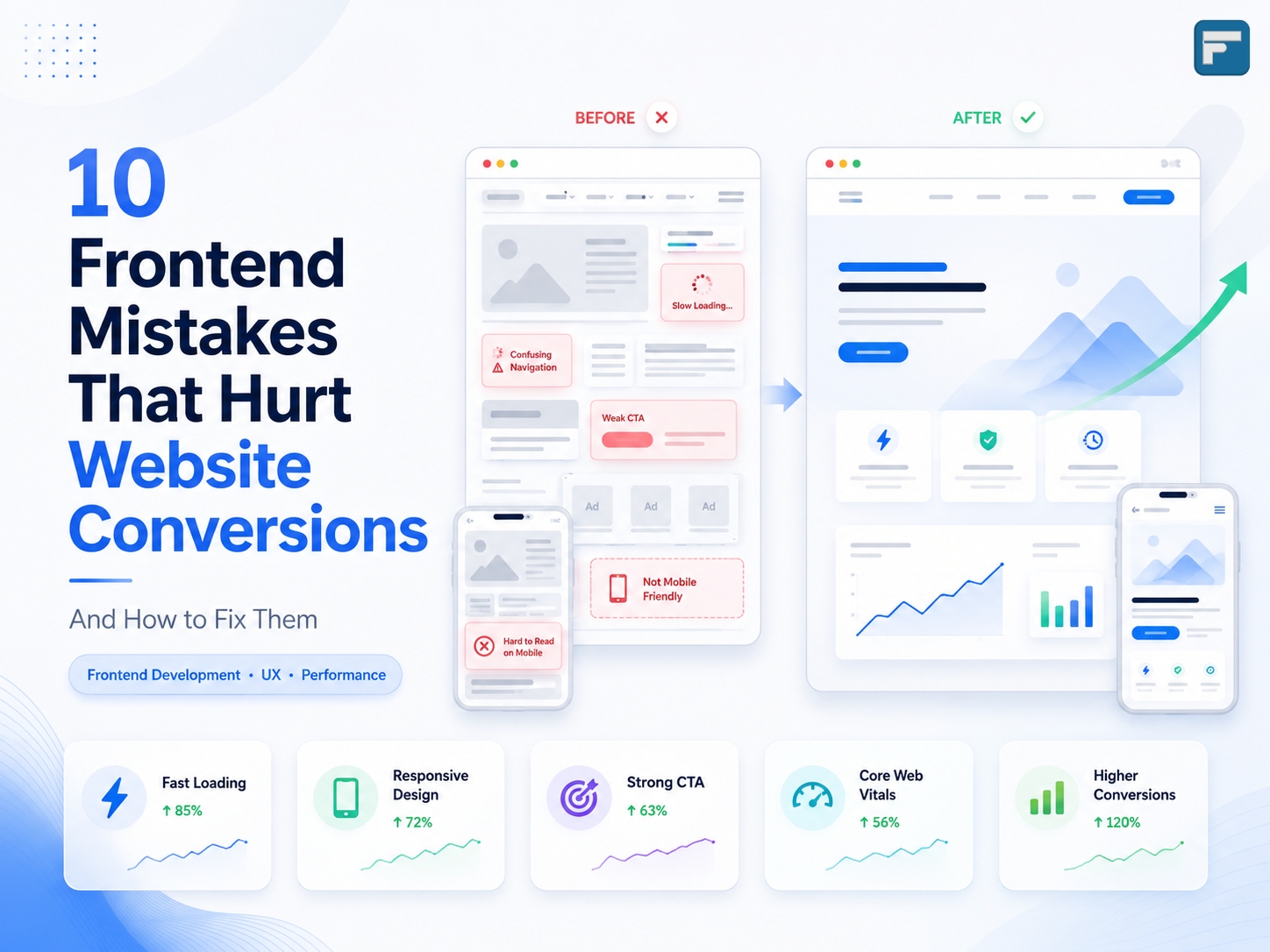
Let’s explore ten common frontend mistakes that quietly reduce website conversions and, more importantly, how to fix them.
1. Slow Loading Pages
Why it hurts conversions
Speed is one of the biggest factors influencing user behaviour. Studies consistently show that users abandon websites that take too long to load.
Even a delay of a few seconds can lead to:
- Higher bounce rates
- Lower engagement
- Reduced trust
- Fewer enquiries or sales
How to fix it
- Compress and optimise images
- Use modern image formats like WebP or AVIF
- Enable browser caching
- Minify CSS and JavaScript files
- Load scripts only when necessary
- Use a Content Delivery Network (CDN)
Pro Tip: Always test your website using Google PageSpeed Insights or Lighthouse before launching.
2. Poor Mobile Experience
Why it hurts conversions
More than half of today’s web traffic comes from mobile devices. If users need to zoom, struggle to tap buttons, or encounter broken layouts, they’ll leave quickly.
Common issues include:
- Small buttons
- Tiny fonts
- Horizontal scrolling
- Slow mobile performance
- Difficult navigation
How to fix it
- Follow a mobile-first design approach
- Ensure buttons are easy to tap
- Maintain readable font sizes
- Test on multiple screen sizes
- Optimise touch interactions
A great mobile experience often results in better engagement across all devices.
3. Weak Call-to-Action (CTA) Buttons
Why it hurts conversions
Visitors shouldn’t have to guess what to do next.
A CTA that blends into the design or uses vague wording often gets ignored.
Instead of:
❌ Submit
Use:
✅ Get a Free Quote
✅ Schedule a Demo
✅ Contact Our Team
How to fix it
- Use clear, action-oriented language
- Make buttons visually prominent
- Maintain consistent button styles
- Place CTAs strategically throughout the page
Every page should encourage users towards a specific action.
4. Confusing Navigation
Why it hurts conversions
If users can’t find information within a few seconds, they’ll likely leave.
Overloaded menus, unclear labels, and inconsistent navigation create unnecessary frustration.
How to fix it
- Keep navigation simple
- Limit primary menu items
- Use familiar labels
- Highlight important pages
- Add search functionality when appropriate
Good navigation reduces friction and improves the overall user journey.
5. Visual Clutter
Why it hurts conversions
Trying to show everything at once often results in users noticing nothing.
Crowded layouts filled with banners, animations, pop-ups, and excessive colours make it difficult for visitors to focus.
How to fix it
- Use whitespace effectively
- Keep layouts clean
- Prioritise important information
- Avoid unnecessary animations
- Focus on one primary message per section
Minimal design often creates a stronger visual impact than cluttered interfaces.
6. Poor Typography and Readability
Why it hurts conversions
Users don’t read websites word by word, they scan.
Poor typography makes scanning difficult.
Examples include:
- Small font sizes
- Low contrast text
- Long paragraphs
- Inconsistent spacing
How to fix it
- Choose readable fonts
- Maintain proper line spacing
- Use headings frequently
- Break content into shorter paragraphs
- Ensure strong colour contrast
Good typography improves both user experience and accessibility.
7. Unoptimised Images
Why it hurts conversions
Images improve engagement, but only when they’re optimised.
Large image files slow down websites and negatively affect Core Web Vitals.
How to fix it
- Compress images before uploading
- Use responsive image sizes
- Enable lazy loading
- Replace PNG files with WebP where possible
- Avoid oversized hero images
Better image optimisation means faster loading and happier visitors.
8. Inconsistent Design Elements
Why it hurts conversions
When every page uses different colours, buttons, fonts, or spacing, users subconsciously lose confidence in the website.
Consistency builds familiarity and trust.
How to fix it
Create and follow a design system that includes:
- Colour palette
- Typography
- Button styles
- Icons
- Spacing guidelines
- Form styles
A consistent interface feels more professional and easier to use.
9. Missing Trust Signals
Why it hurts conversions
Visitors often ask themselves:
“Can I trust this company?”
If the answer isn’t obvious, they may leave without contacting you.
Trust-building elements include:
- Client testimonials
- Case studies
- Google Reviews
- Company certifications
- SSL security
- Contact information
- Client logos
- Years of experience
These elements reassure users and encourage them to take the next step.
10. Ignoring Performance Monitoring
Why it hurts conversions
A website isn’t something you build once and forget.
Without monitoring, issues like slow pages, broken forms, or declining user engagement can go unnoticed.
Tools worth using
- Google Lighthouse
- Google PageSpeed Insights
- GTmetrix
- Microsoft Clarity
- Google Analytics
- Google Search Console
Regular testing helps identify opportunities for continuous improvement.
Final Thoughts
A beautiful website alone doesn’t guarantee conversions. Every interaction, from page speed and navigation to typography and mobile responsiveness, shapes the user’s decision to stay, engage, or leave.
The good news is that many of these issues can be resolved with thoughtful frontend improvements. Small changes, such as optimising images, simplifying navigation, improving readability, or strengthening your calls-to-action, can have a measurable impact on user engagement and conversion rates.
As a frontend developer, I’ve learned that the most successful websites aren’t necessarily the most complex, they’re the ones that make every interaction simple, intuitive, and fast.
Whether you’re running a business website, an eCommerce store, or a corporate platform, investing in a better frontend experience is an investment in better business outcomes.
Need Help Building a High-Converting Website?
Whether you’re planning a new website or looking to improve an existing one, the team at Futentia Solutions can help you create modern, responsive, and performance-focused websites that deliver measurable business results.
Let’s build a website your visitors will love, and your business will benefit from.